Content Holder
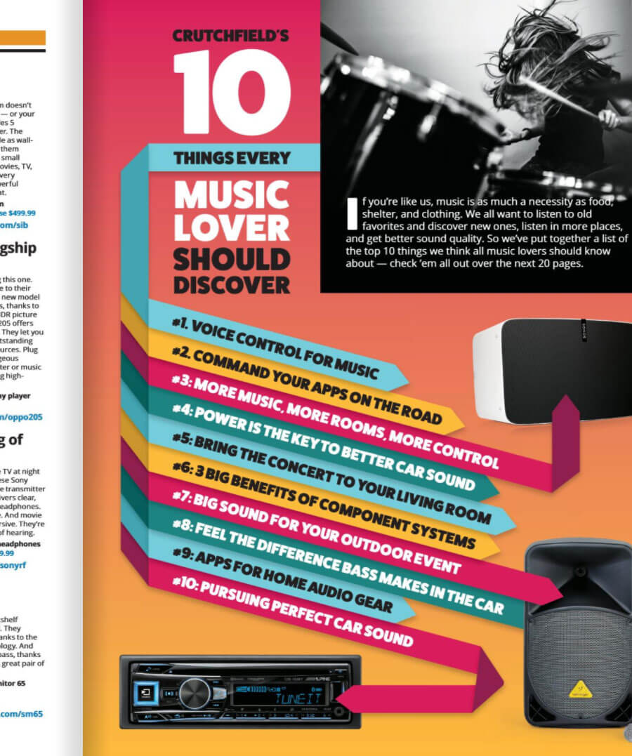
Ten Things Campaign
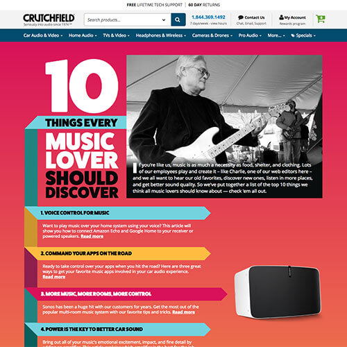
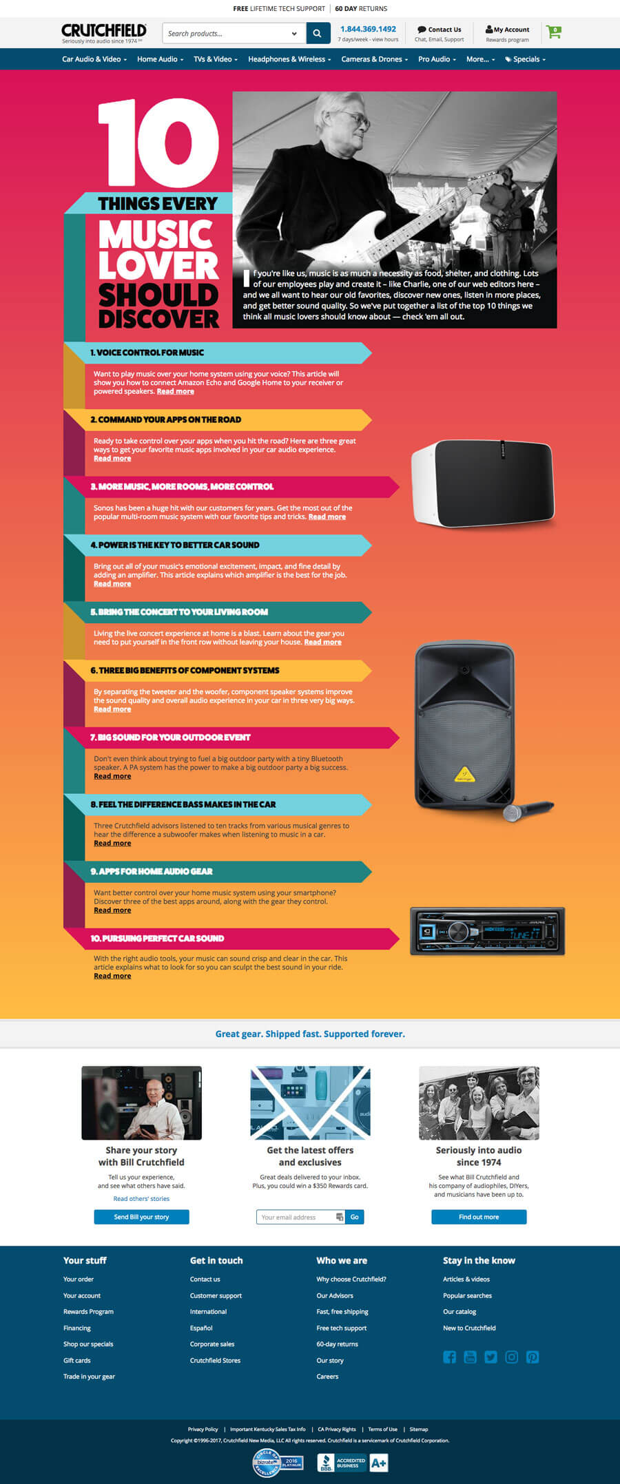
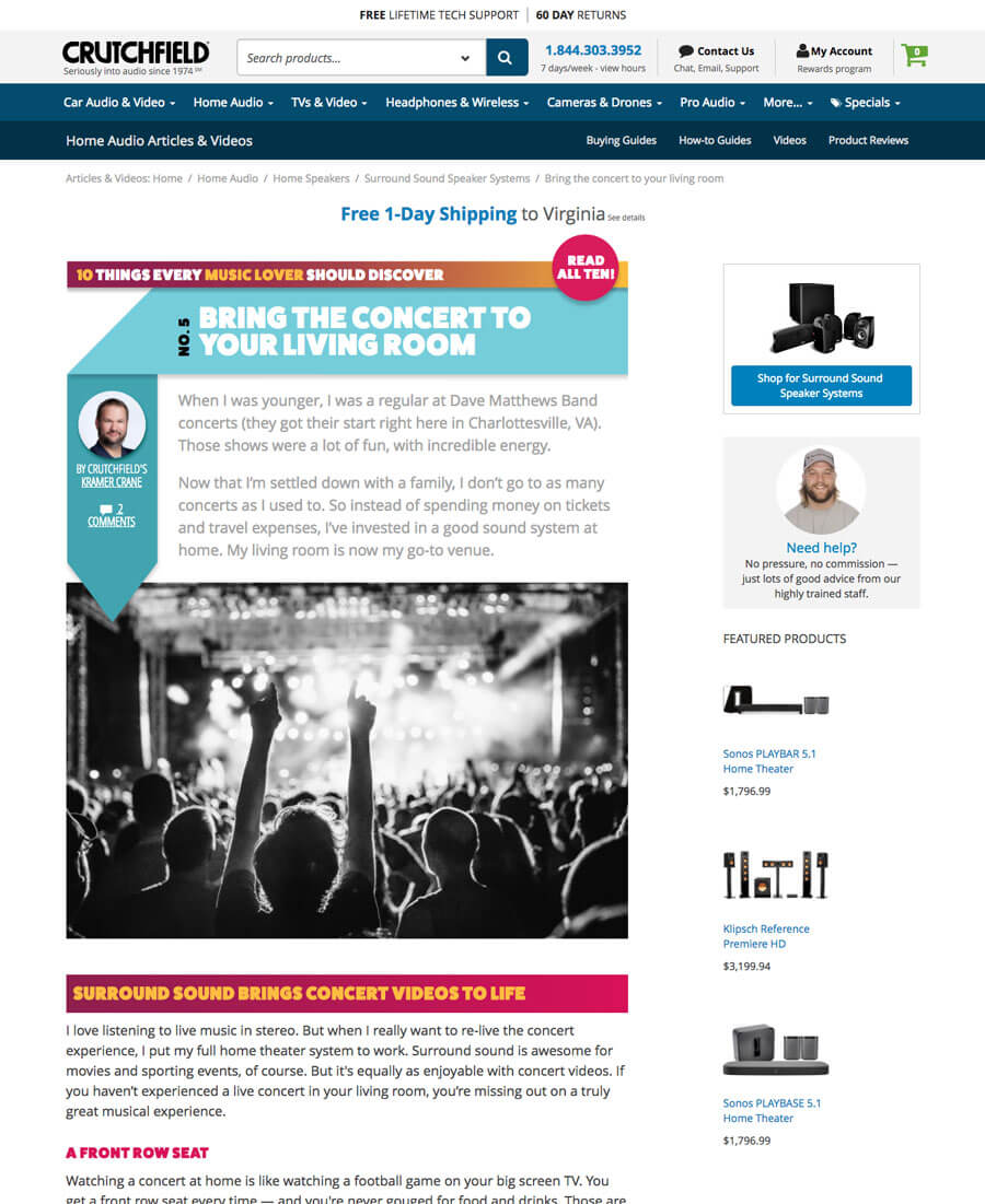
The Ten Things campaign started in our print catalog, so carrying the look and feel of it's energy was very important.
With the exception of the desktop articles being a jpg header, I designed this mobile friendly campaign completely using CSS. The landing page as well as the mobile headers are all build out from scratch.
This project was quite challenging because the server that the editors use to write the articles is on a completely different node than the development server. It took careful corrdination to make sure that all the code was released in tandem with the publishing of thier databases. I am quite pleased with the way it came out.
Scroll to view whole page


Careers Page
Click to see the "before" page
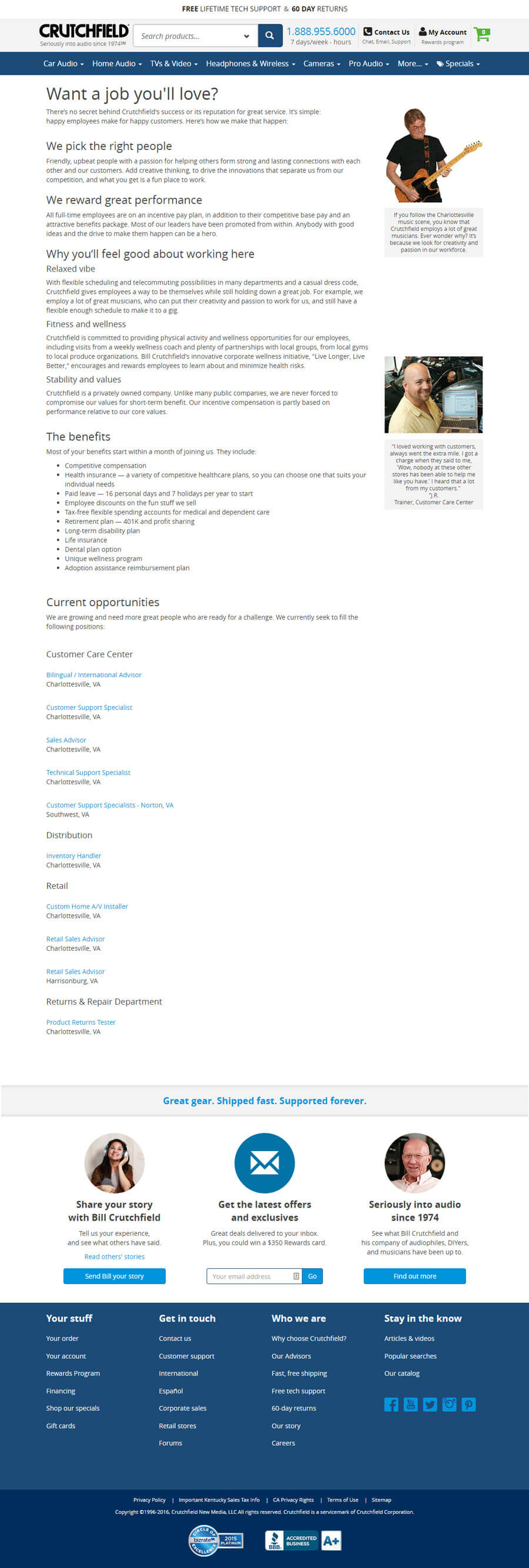
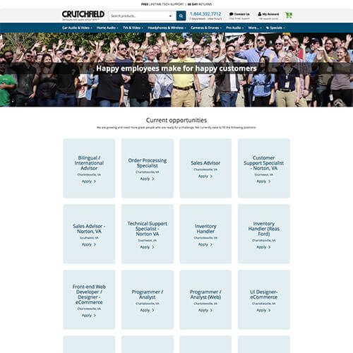
This page was originally a portal to our jobs board hosted by a third party. It was clunky and certainly not mobile friendly.
I designed this page to be more inviting, not only to the company, but to our region as well.
This mobile-friendly page is built on a Bootstrap framework, CSS Flexbox, and some javascript. In the "Join Our Team" section, there are rollover animations on the photos that reveal a short sentence about each.
Scroll to view whole page

What's New
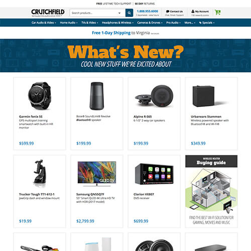
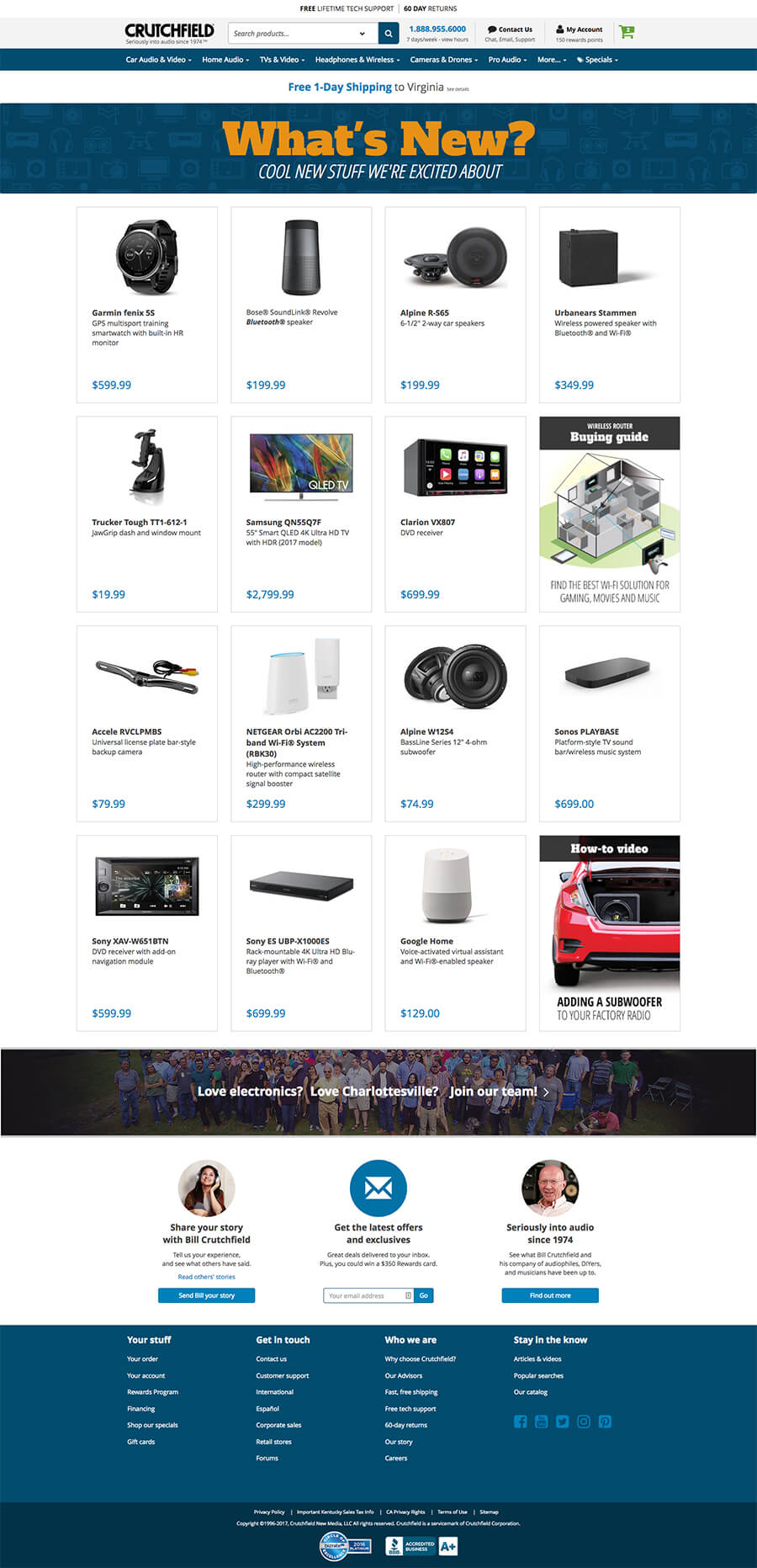
We needed a page that would highlight new products that were sale in the company. The content is driven off of an XML file. At a later date, this will be populated by a database and an online editor.
I designed this page to have visual interest but not distract from the products. There was talk about using real products in the header graphic, however that would have led to having to update the graphics more frequently. I chose to go with icons in the header to help give the page more longevity.
This mobile-friendly page is built on a Bootstrap framework with CSS Flexbox to help control image skewing.
Scroll to view whole page
Advisor Page
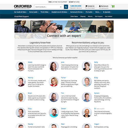
Our advisors used to choose their own photos. Some were cats, others boats, etc. but they were often poor representations of who we were as a company. As Art Director, I spearheaded this project and worked with our studio to re-shoot every employee to look consistent with our Brand.
I had over 90 employees in two locations across the state to organize through multiple shoots.
This mobile-friendly page is built on a Bootstrap framework.
Scroll to view whole page

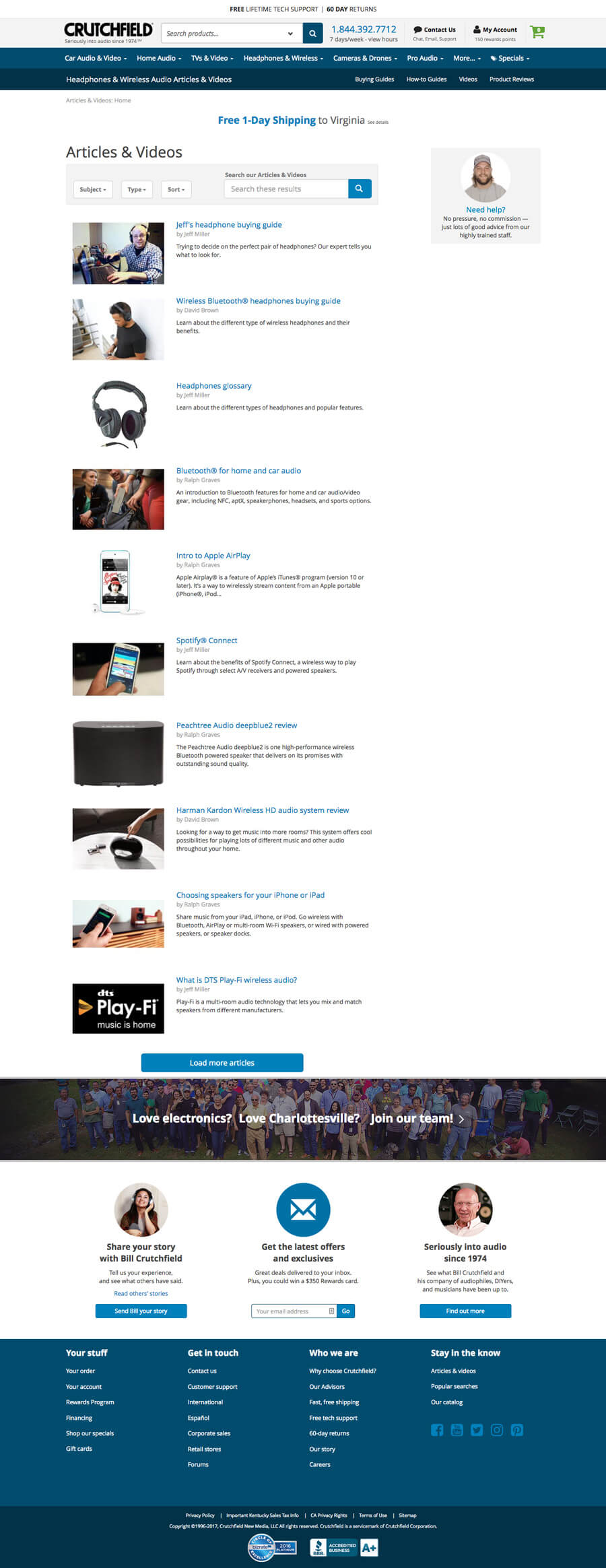
Learn Home Page
Click to see the "before" page
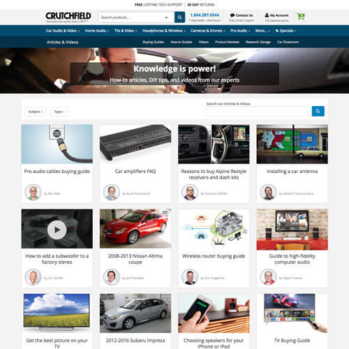
Crutchfield hosts a whole library of "learn" content. I scrapped the old design and went with a fresh, new look that was more engaging. It also helped put a face to the posts so customers could see and develop a trust with our writing staff.
This mobile-friendly page is built on a Bootstrap framework with CSS Flexbox.
Scroll to view whole page

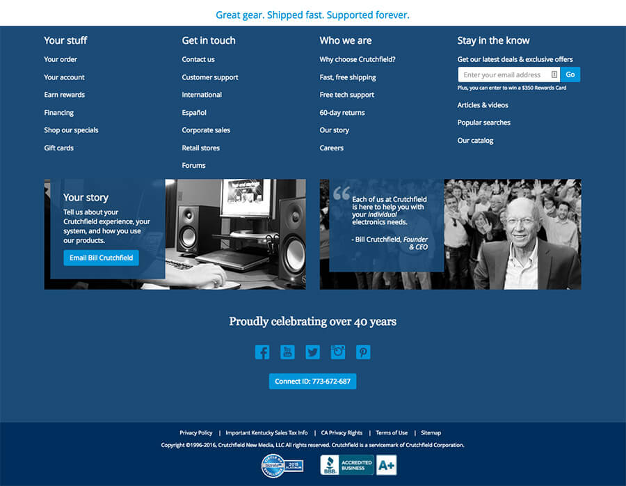
Site Footer
Click to see the "before" page
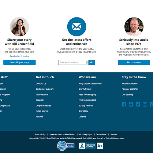
The old footer for the site was getting cluttered and lacked engagement.
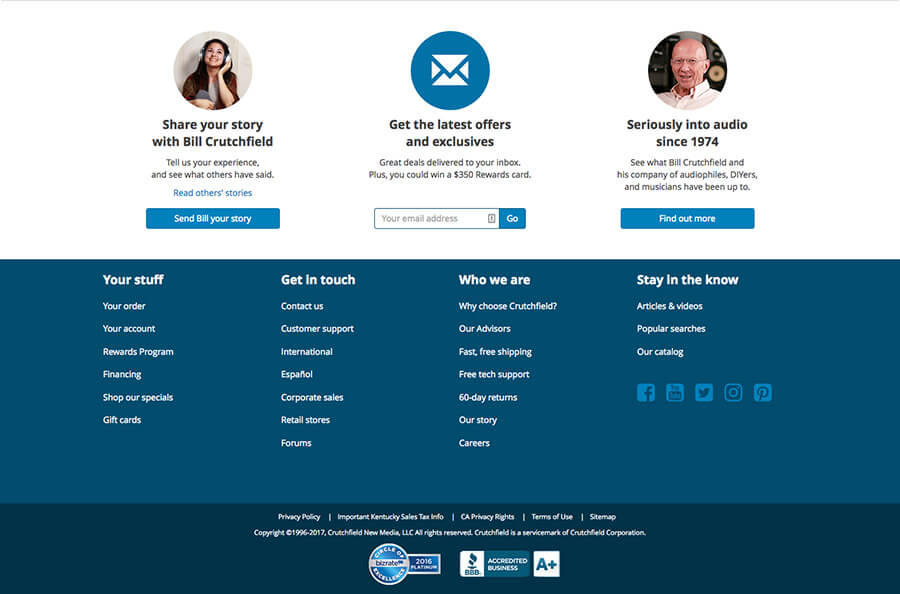
I designed the new footer to be dual purpose. The top section was for engagement and separated into three areas: (from L to R) the customer's happiness and desire to engage, the customer's desire to get information from the company, and last was for the customer to know that we are a company of people, not just a faceless ecommerce store.
This mobile-friendly page is built on a Bootstrap framework.
Crutchfield Retail Store Interactive Displays
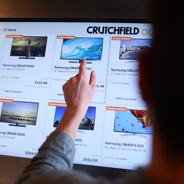
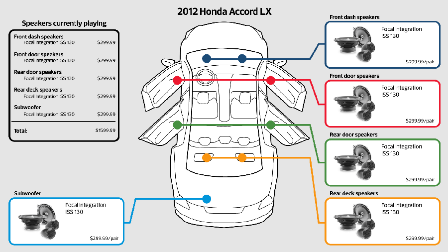
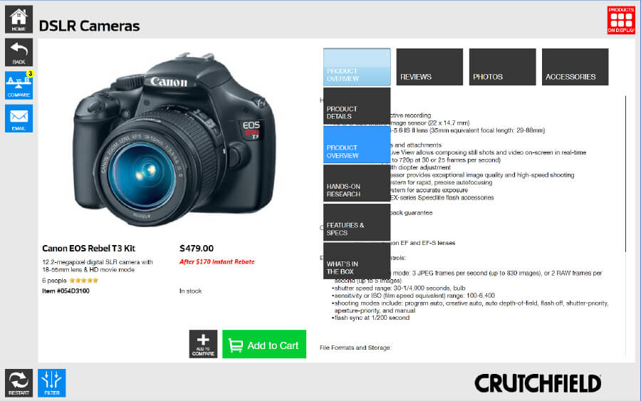
Charlottesville, VA hosts Crutchfield's main "concept" store. The idea is that the customer can enter the store and browse for products on touch-screen displays. There are top rated products available to demo at the store as well.
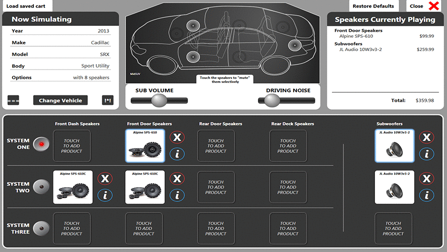
In addition, there are several "listening rooms" where customers can select their speakers (for car or home) and listen to any of them in our virtual listening room. I designed the front-end of both the shopping kiosks and the interactive listening room controls.
This project was continually in flux so we could respond to customer feedback and make improvements on a regular basis. The project is build using Microsoft XAML.



Crutchfield Canada
Click to see the "before" page
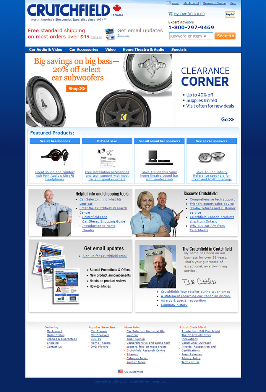
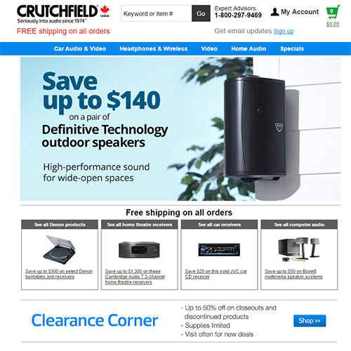
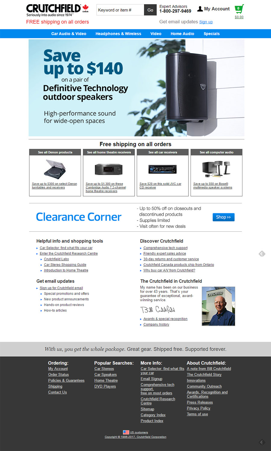
This project was a demonstration in how vast improvements in sales can be made with minor design tweaks.
This site was originally built from a "package" years ago that was not friendly to edit. Sales in Canada were low, so there was little effort given to maintaining the site. It looked horrible and dated, but we could never get a redesign on the schedule because the revenue couldn't justify the work.
One of my first tasks as Art Director was to just make minor tweaks: losing the background color, making images larger, improving the navigation and homepage, etc.
Since those tweaks were made, we saw 31% growth in sessions, 72% in orders, and 60% in sales. This got the VP's attention and a full site integration was later scheduled.
Scroll to view whole page
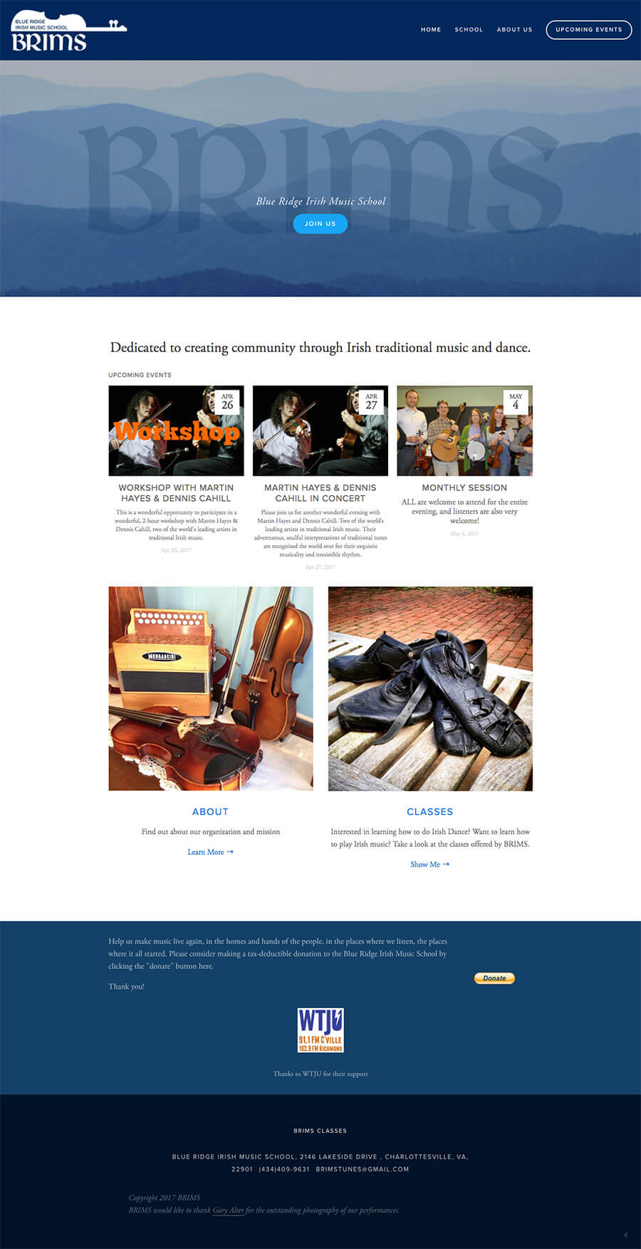
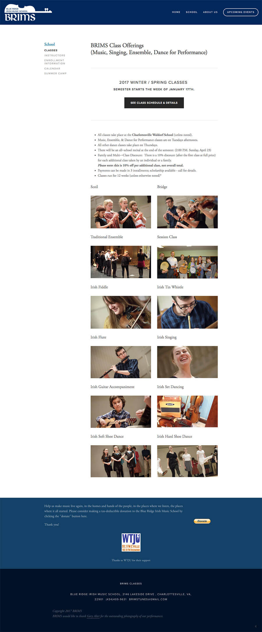
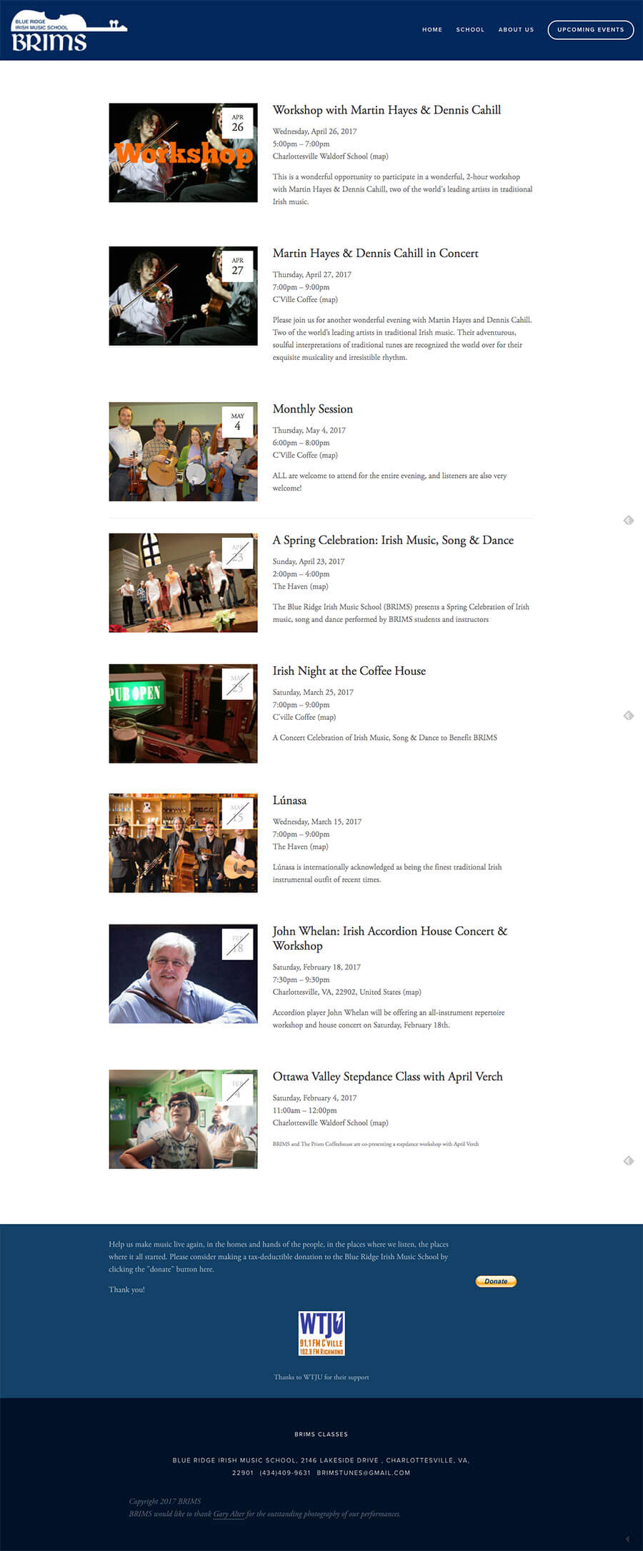
Blue Ridge Irish Music School
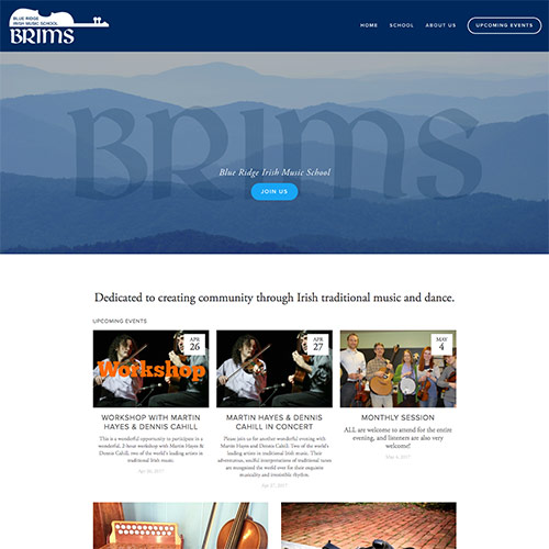
I am a board member on BRIMS and assist them with branding, graphics, and web work.
After re-designing their logo and tightened up their Brand, I built this site on a purchased, templated framework. This was chosen to give ample flexibility so that multiple members edit concert information, store inventory, class details, etc.
Scroll to view whole page
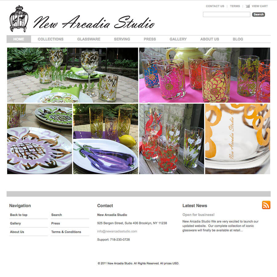
New Arcadia Studio
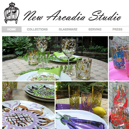
New Arcadia Studio was a design collective created to re-introduce a more decorative hand to everyday products.
I worked closely with the artists and principals to adapt sketches, digitize and manipulate original art to comply with FDA guidelines and to make press-ready artwork for various application methods in glass, ceramic and textile.
I developed brand identity through business card design, sell sheet and catalog design, product packaging, and subsequent business collateral. In addition, I designed and built a custom e-commerce website.
